Wax Magic
Logo Design + Packaging Concepts
Wax Magic Candle Company came to me with a name and an initial logo idea—it was my job to add a little magic and bring the vision to life. The brand centers around luxuriously magical handmade candles designed to be enjoyed with intention, while also offering a unique, reusable vessel after the final burn.
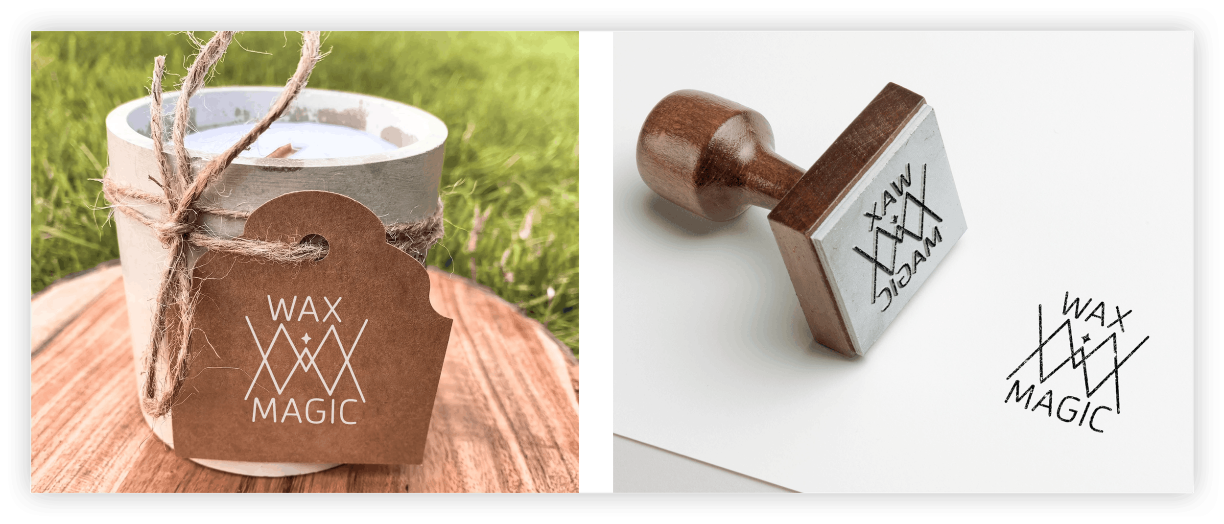
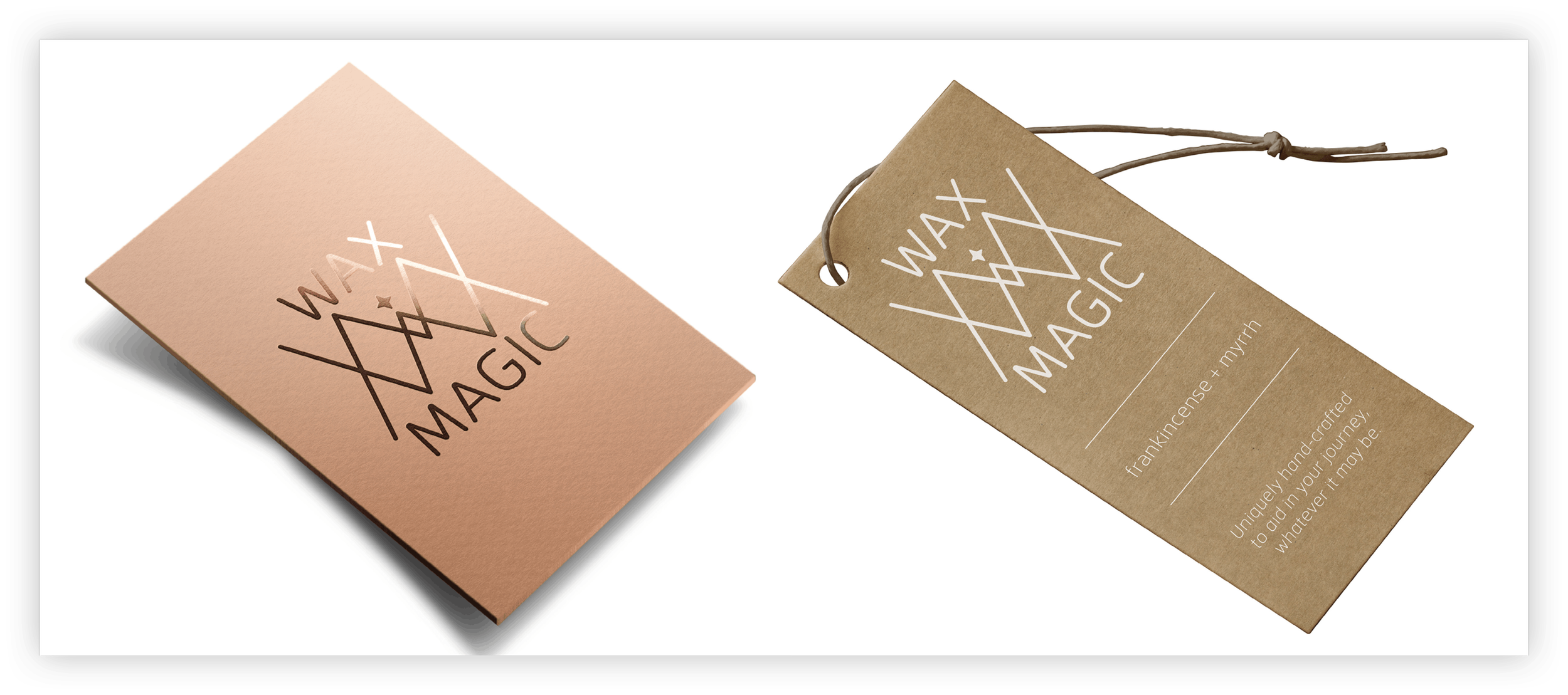
The goal was to create a mark that captured both the luxury and sustainability of the brand while still embracing its witchy, mystical vibe. I began by stacking the letters “W” and “M” to form shapes reminiscent of a crystal tower or point, symbolizing amplified intention and energy. I then added a subtle sparkle detail to evoke both a candle flame and a sense of magic. And with a few more clicks of my magic mouse, the Wax Magic Candle brand sparked to life.
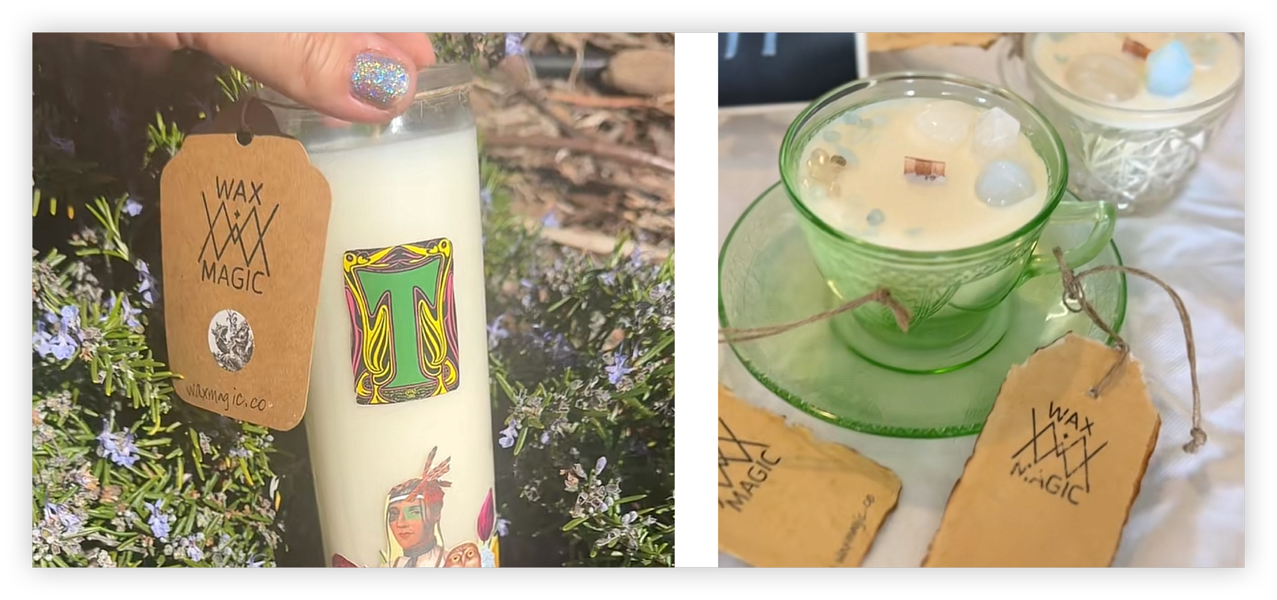
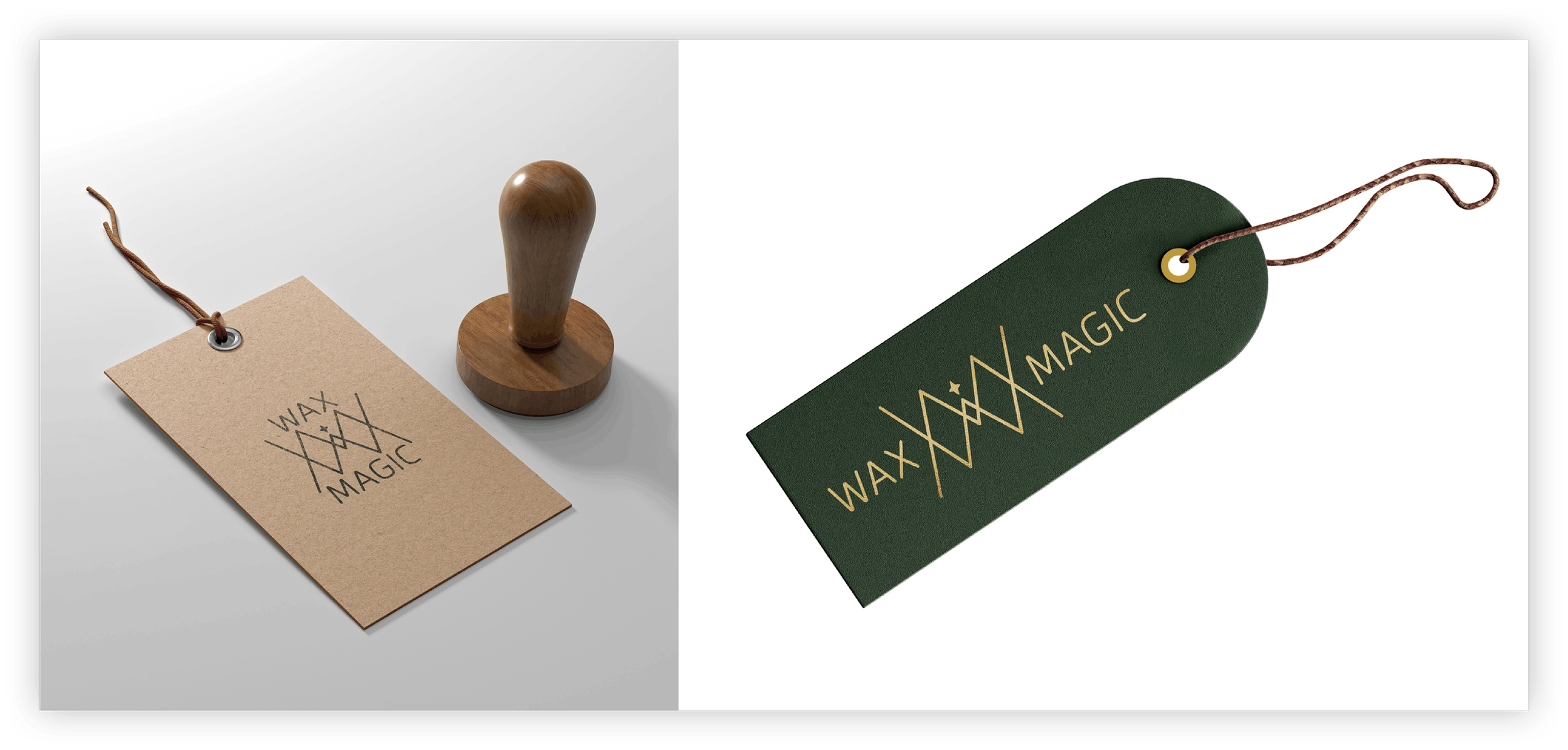
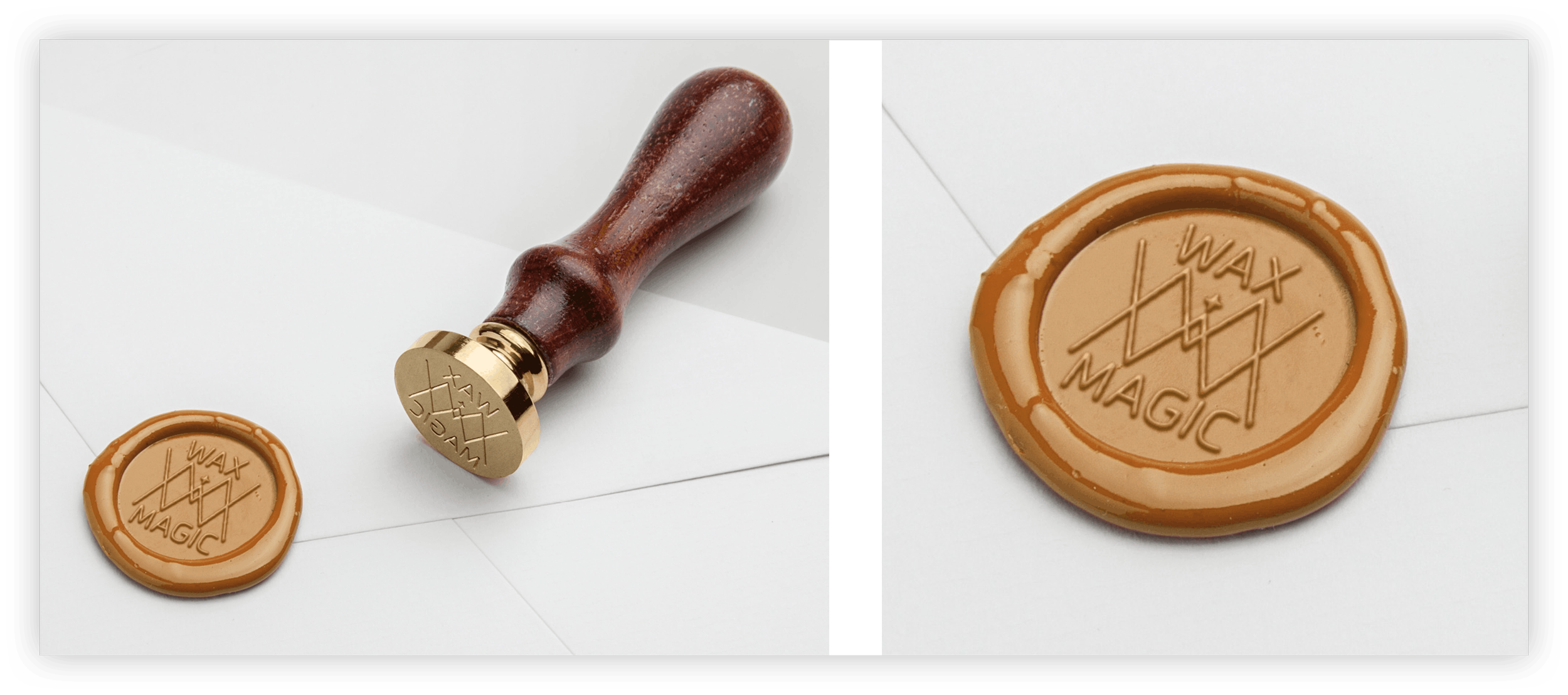
To further bring the identity to life, I created mockups showcasing how the logo could be applied across packaging and branded materials with an organic, handmade feel. Using elements like stamps, brown paper tags, and textured applications, I explored branding possibilities that made the company feel fully realized before it officially launched. The tags ultimately stuck and became a signature part of the Wax Magic aesthetic that continues today.
You can see this brand in action here: waxmagic.co