Stillwaters Harvest
Brand Identity + Website
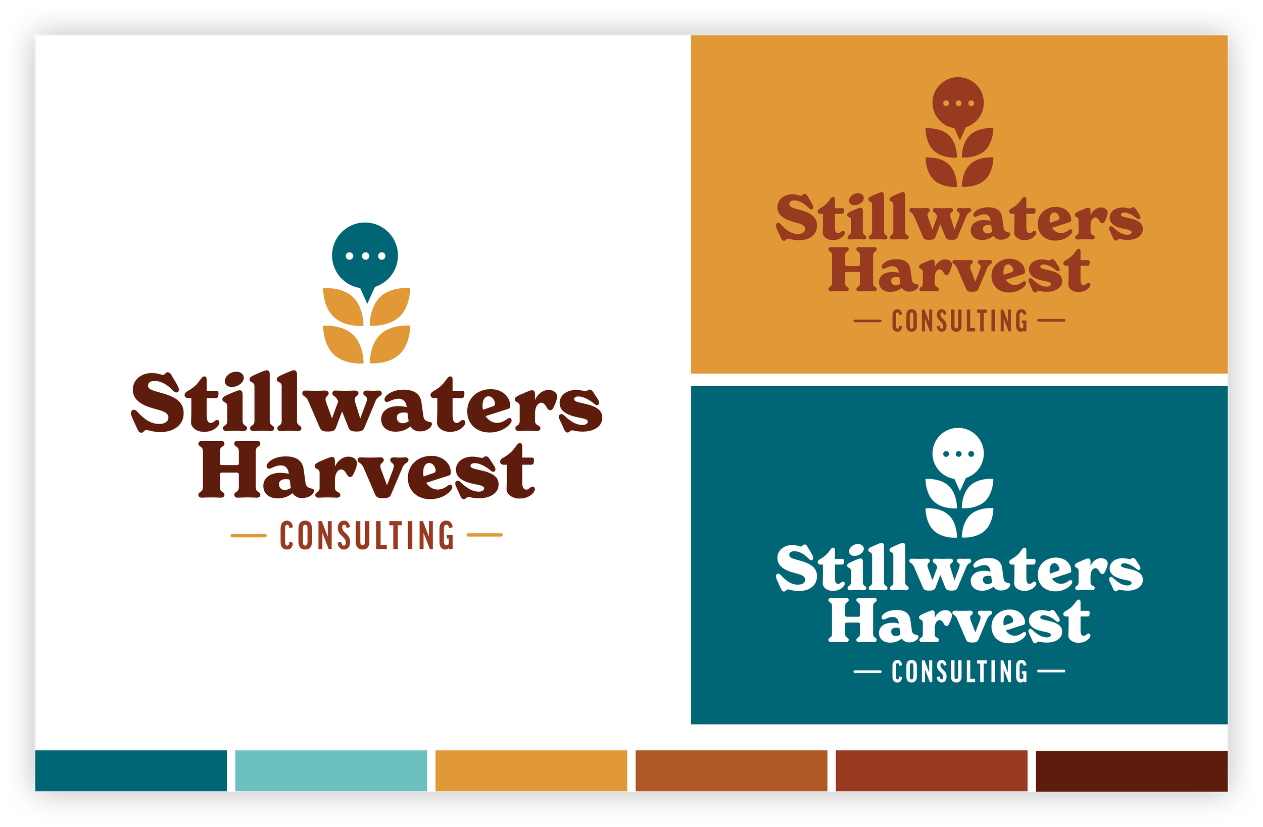
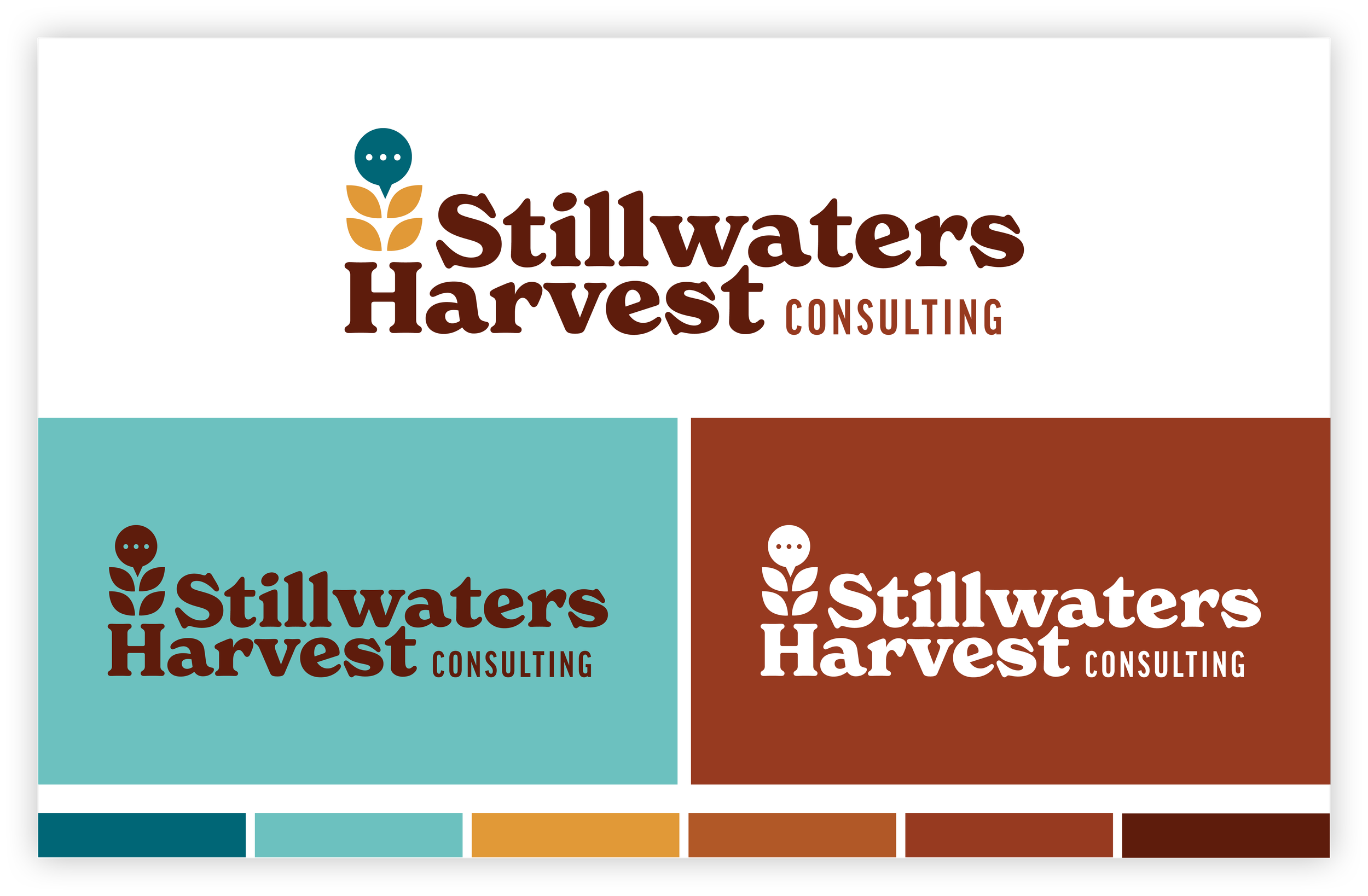
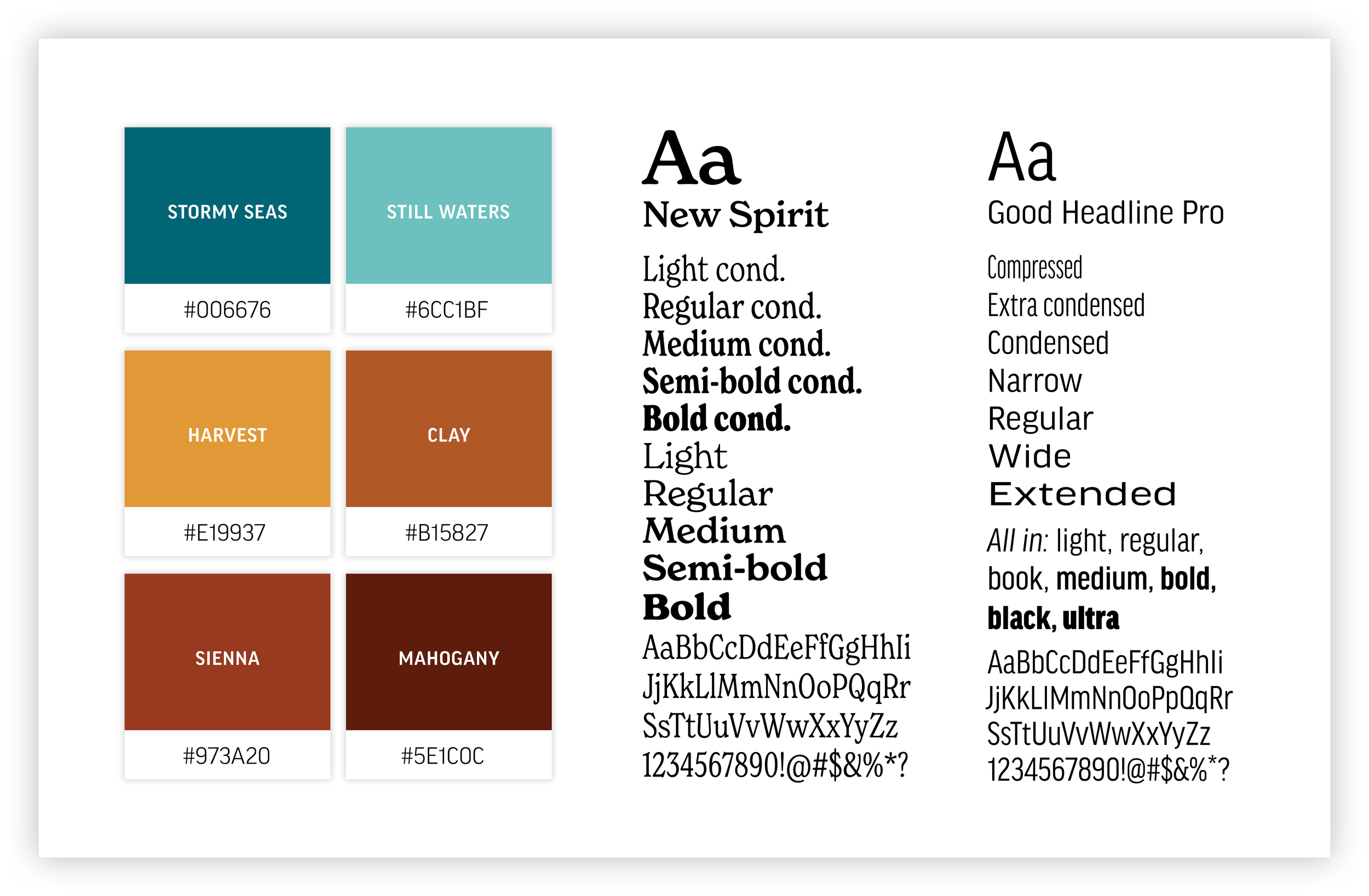
Stillwaters Harvest initially approached me for a website build, and while they had an AI-generated logo, it wasn’t a viable foundation for a professional brand. So before diving into web design, we agreed it was important to establish a strong, fully original brand identity first. The first step was redesigning the logo into a polished, custom mark—something functional, versatile, and unmistakably human-made. The brand mark itself was designed with intention. A subtle stalk of wheat references the “harvest” in their name, while a small chat bubble at the top nods to the consulting side of the business. The combination felt distinctive and thoughtful, yet approachable. When it came to color, they asked for “professional earthiness”—a warm, calm palette inspired by nature. The resulting colors strike that balance, drawing from natural tones that feel both inviting and refined. With a clear and cohesive brand identity established, we were then ready to move confidently into the website design phase.
You can see this brand in action here: swharvest.com
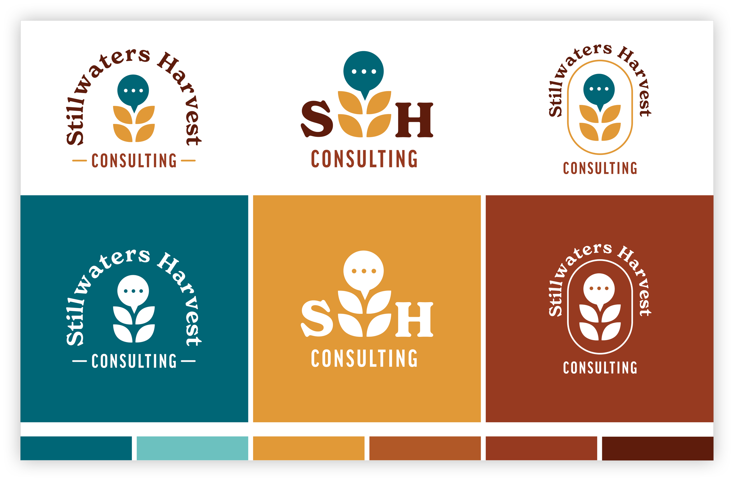
I presented a mini lookbook showcasing multiple logo variations for the selected concept, along with the accompanying fonts and color palette.
The logo concepts were integrated with photography to explore real-world application and brand cohesion.